Everything wrong with the Nigeria Air Brand
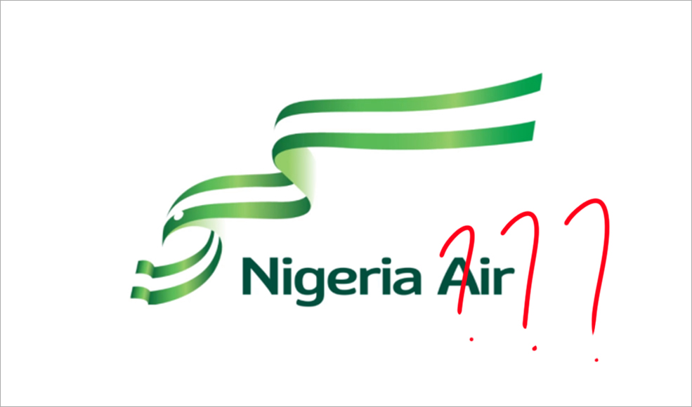
The issue of having a national carrier is one that has been met with a myriad of reactions from both ends of the spectrum—pleased and displeased; seen as necessary or an absolute waste of resources. Virgin Nigeria was the last national carrier, from 2005 to 2012. You’d think that with six years filled with explosive technological expressions, a rebrand will come with the boom effect. Unfortunately, this effect has been quite the contrary, rendering a lot, especially designers, angry casualties. A new logo was recently unveiled as part of the rebranding path decided upon by the Ministry of Aviation, and it really is something.

Before we go any further, let me state that this is our opinion about it all and nothing more.

Rationale: Story, Story...
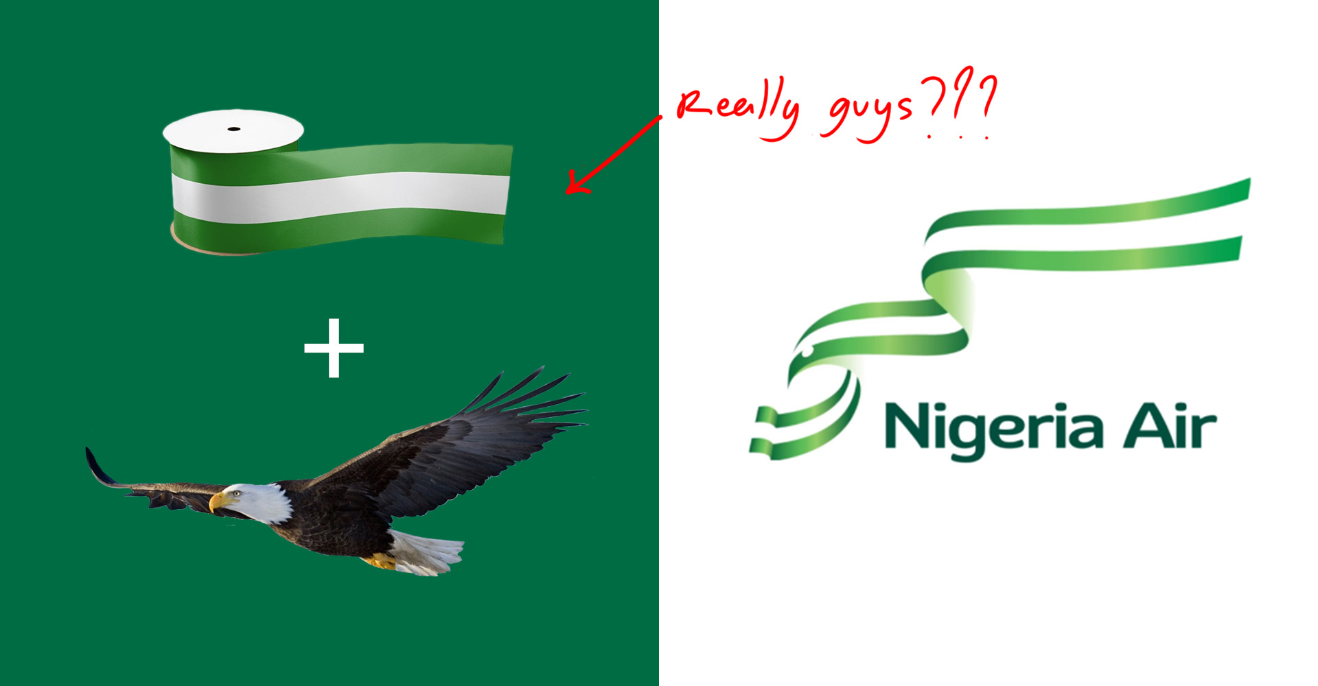
First off, what were they thinking!?! The rationale behind this new logo is that it’s a representation of a bird, not just any bird, the eagle—our emblem of strength, and for a country, as portrayed on our coat of arms. The colours are a clear reflection of our flag. The portrayal of the eagle is an utter visual mockery of the bird and all it stands for, as it is represented with a fabric; a ribbon! Who represents an eagle with something as flimsy as a ribbon? I get that we are the giant of Africa and also now the poverty capital of the world, talk about extremes. Is this a subliminal mockery of the irony that we nearly clearly are as a nation? How is the strength that the eagle represents, not just among birds, but clearly for the entire country, best represented with a fragile ribbon blowing in the wind? Are we that fickle? It’s a wonder how this was even approved, but what about Nigeria isn’t an absolute wonder these days, to be honest.
Balance: ...Just off
When it comes to appraising the quality of a logo, one of the key things to ensure is balance. Every element that we see in a design has its own visual weight, and the problem of balance arises when one element dominates the other unnaturally, creating an imbalance. Take a quick look at the Nigeria Air logo again, see what I mean?
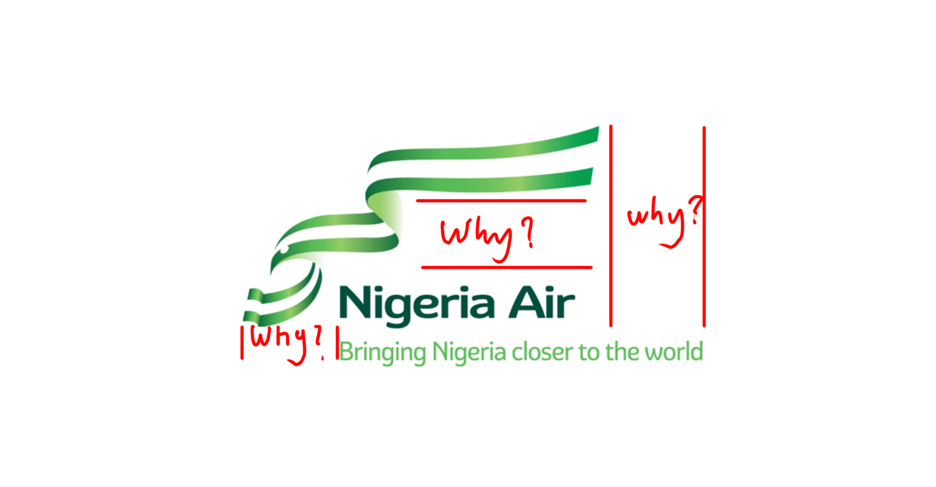
Agreed, the rule of balance can be pushed and occasionally broken, but always, in a visually appealing way. However, bearing in mind that the logo will be viewed by the masses, not just those with an eye for great art, a balanced design is always the safest approach.
Font Management: My handwriting is nearly better
Font is an integral part of any logo. The importance of picking the right font should not be underestimated. Font choices need to be purposeful and appropriate. Is your font saying “beach vacation” when it should be saying “job interview”? Do the elements of your font and icon clash, or do they complement each other? Are they effectively communicating the qualities you want to project?
At first glance, the font choice for Nigeria Air just looks drab, like it was picked randomly from Microsoft Word’s default set. On taking a closer look, and after a bit of research, I find that the San Serif and Display hybrid is of the Gesta Font Family with deliberate edits to corners of each glyph.
It is my opinion though that this font does no justice to complement the narrative of strength and reliability symbolic of the eagle. It is rather a slightly playful and edgeless selection that in no way gives off the modern, relevant or clean overview befitting of a National Airline Carrier.
Color Choice and Management: Negative
The colours chosen here are pretty obvious, the green and white to match the colours of the Nigerian flag. I however, feel that the use of the gradient with this logo is unnecessary and adds very little value to the design.
Let me explain, gradients are traditionally used in design to add the perception of depth. However, these days, gradient use in logo design is generally frowned upon and if used, is done deliberately and sparingly.
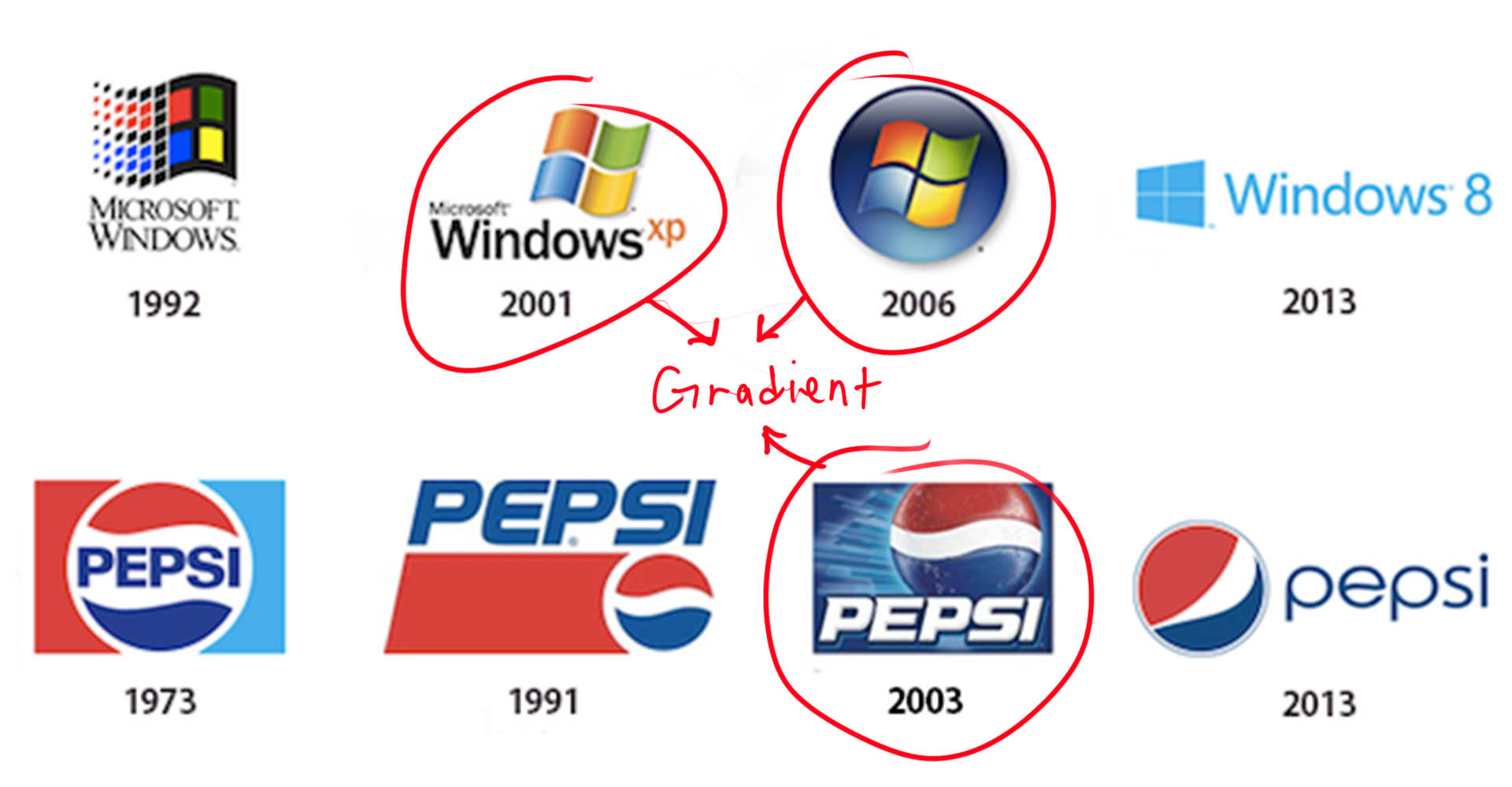
At TCS, we are minimalist thinkers and we say that – if it doesn’t have to be there, it shouldn’t be there – As much as I do not agree with the choice of a ‘ribbon eagle’, I believe that this same logo can be achieved, even to a higher level without the use of a gradient.
Relevance: Show your working
Era after era, juice flavours differ. What’s the juice of this era? Or is it the sauce now? I can never really tell what’s hip with these kids anymore.
Anyway, can you tell what era these logos are from?
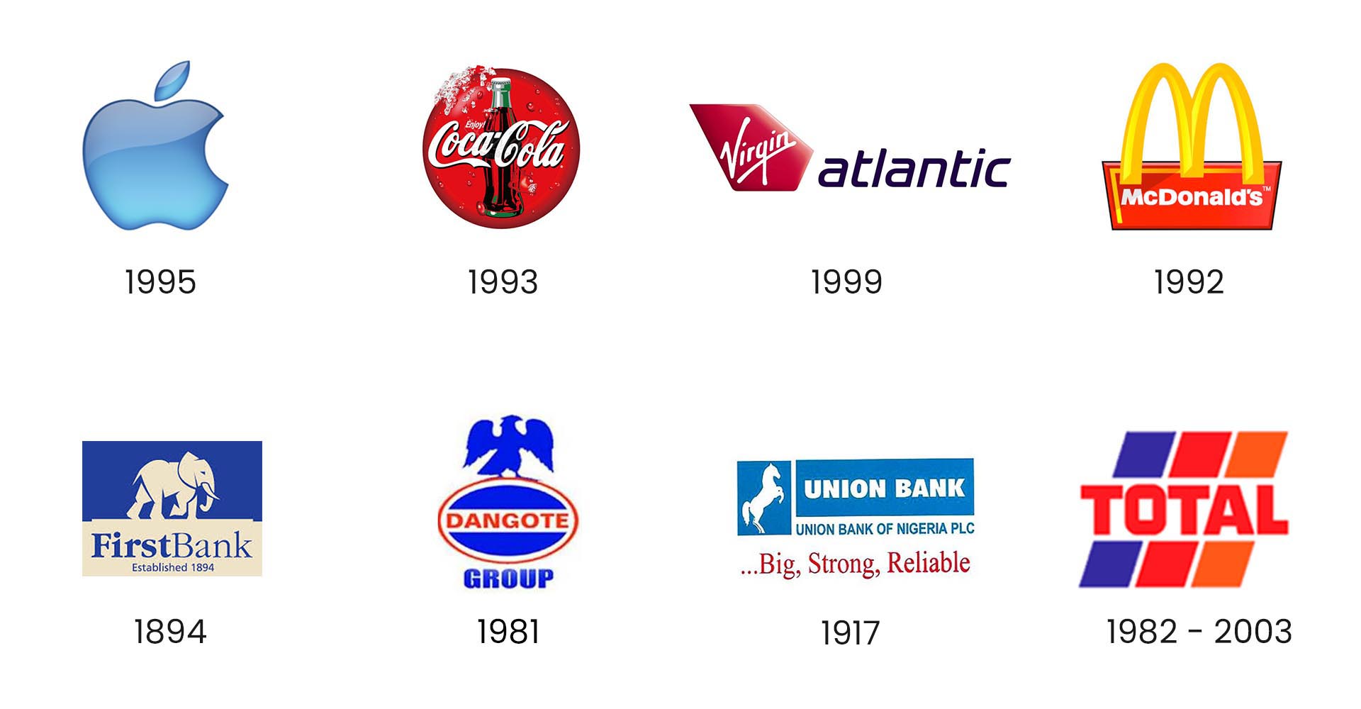
How about these ones?
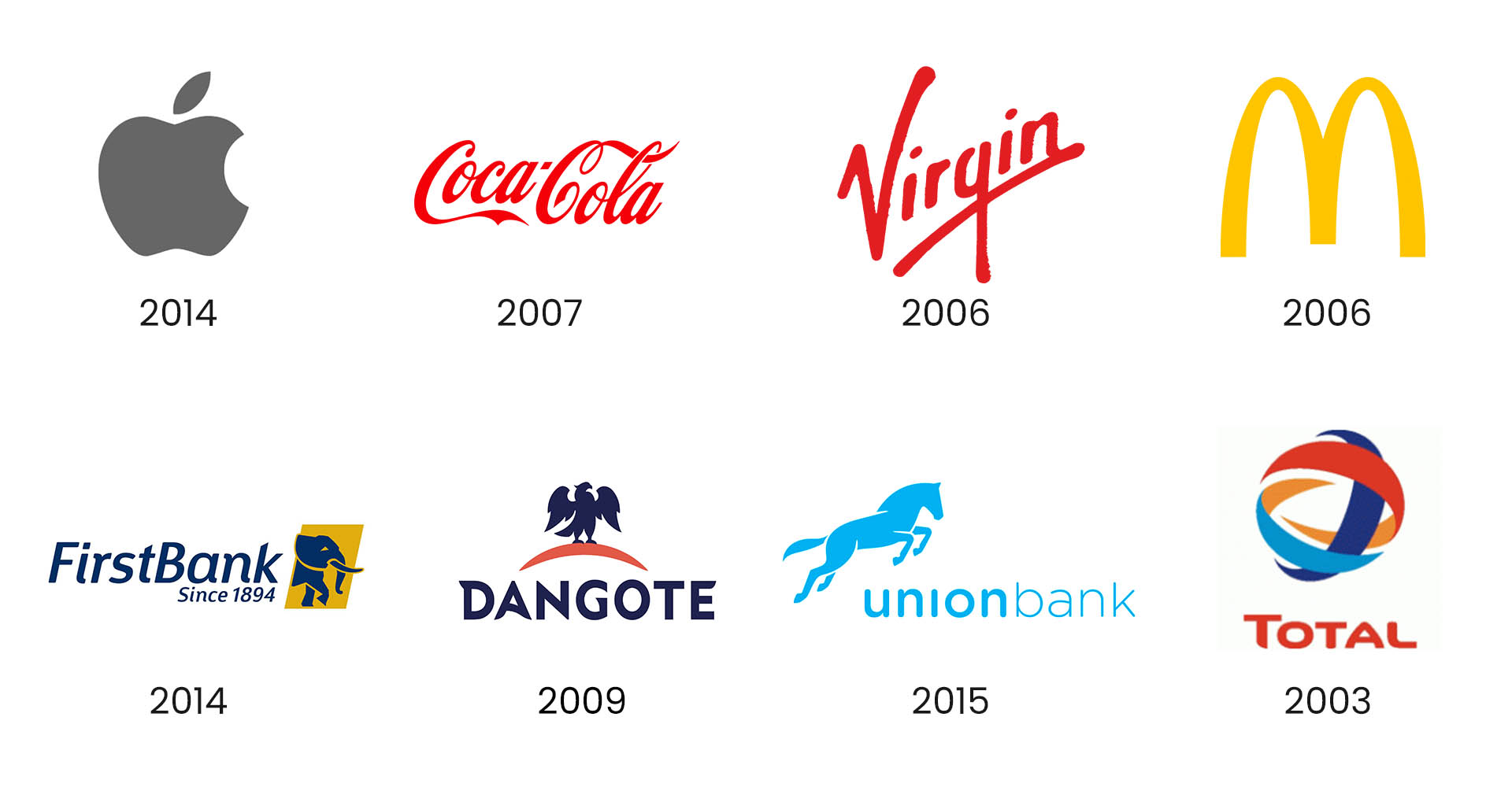
I’m sure you can now guess with a high degree of certainty, where the Nigeria Air Logo fits. This logo is clearly a fine design of a tardis; a time machine that effortlessly transports you to the 80s and 90s where logos were more complex and highly, highly stylized.
Another subliminal note— Are we being portrayed by the Bahrian based design agency that designed this Logo as backward? Or as just being more used to difficulty, than well, ease?
Again, my personal wonder.
Functionality: Testing, testing...
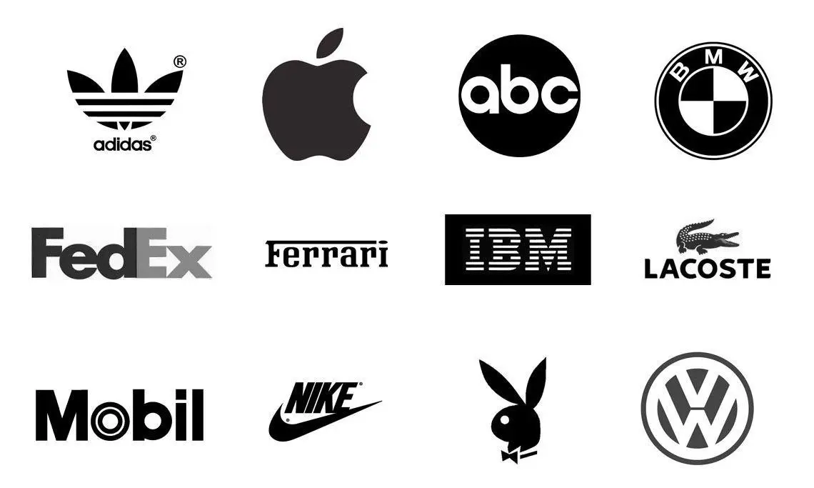
Great logos need to represent a company in many different contexts and still get the message across. A logo may be seen on the web, or on a variety of promotional products such as a brochure, a t-shirt, or on glassware. It could be used on dark backgrounds, on light backgrounds, on textured surfaces, or could be used in various sizes like as a Favicon (Those tiny icons on your browser tab) or on a 40ft billboard. It’s important to know that simplicity does not mean that the logo is missing anything. In fact, to aid in functionality, the logo must be simple.
Imagine this new logo as an app icon on your phone, and tell me the animal you see in the ribbon is still a snake. I mean, an eagle.
Conclusion
Let’s think about it, who really is to blame in all of this, when the government themselves unveiled Nigeria Air without first securing domain names. And shout out to lazy Nigerians that don’t sleep. Olumayowa Elegbede, for being sharp enough to buy all possible versions of the domain name, and is now putting it up for sale at $66,000. Talk about being both timely and timeless! This act is more timeless than the entirety of the Nigeria Air Brand.
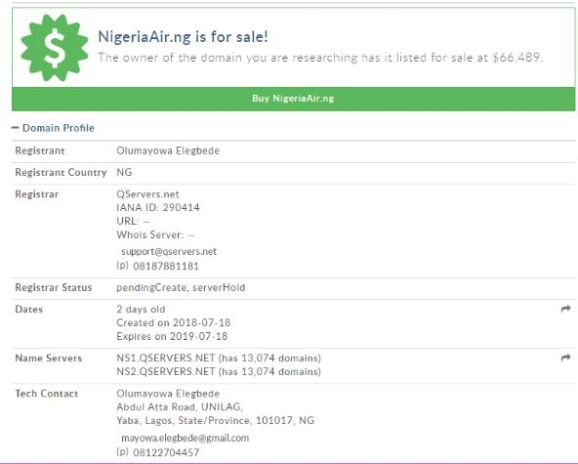
The question now is, will the government take this bid or will they rebrand? I really, really hope they choose to rebrand (Sorry Olumayowa).



ITORO!
You have some valid points here. The balance is obviously way off (the tagline at the bottom is just the worst), gradients on logos are now more for RGB displays than the original logo itself, and the font is bleh (even MTN can boast of a better font).
In their defense, they might have been going for a float-like-a-butterfly-sting-like-a-bee type narrative with the choice of a ribbon – on second thoughts, that was not exactly an optimal decision, but oh well. They say design is like a joke, if you have to explain it, it’s not that good.
For sanity’s sake, I am choosing to believe that the design agency towed the “the client is always right” line when it came to selecting the sample and making final edits. It probably was a random sample, they threw in “just because” but hehehehe….X-D. Note to self – Do not send a logo sample “just because”, it may dent your career
My own major question is; why this contract was outsourced in the first place??
Toast
My best guess is it was outsourced to them as a favour to some major political or financial influencer. I might be wrong but I wouldnt be surprised if I am not
Eniola
I’m don’t know about design or branding and all that but even as a lay man; I agree that everything is wrong with the brand. it’s a shame really…meanwhile shout out to mayowa? . Nice review Toast!
Toast
Mayowa is a G. Everybody should try to be like Mayowa
Banke
Very nice read. Again shout out to Nigeria for never ever failing to disappoint us
Nene
Awesome write up. I definitely agree, the logo is tacky at best and that’s coming from someone with very little knowledge on designs and all.
Toast
Thanks ?
Ayomide
I also wonder why the designing of the logo was outsourced … Nicely written review Toast!
Toast
Thank you
Gee
Apart from the branding itself, when it comes to strictly the design, I’d say it isn’t as horrible as you’ve depicted. More than half of the issues you have with the logo are quite technical. Balance and gradients, while very obvious to designers, are not always noticeable to the general populace. If the whole idea was executed properly, these design issues would most likely have been ignored. As for the bird, some people see it as a bird and a flag, not a bird and a ribbon. It’s an average logo, not an abysmally bad one
Toast
Thanks for the feedback Gee,
I agree that the technical and functional issues might go over the lay-man’s head as all they see is the aesthetic of it but then you have to realise that from a business standpoint, these issues will affect and limit the business’ application of this logo both now and in the future. They are the biggest losers here.
Also, the Nigerian flag is made up of vertical blocks of color not horizontal thereby informing the decision that it is a ribbon with Nigerian flag colors.
Creo
As a brand expert, i know that there can also be some valid points for their choice of logo.
However I think they should have created more awareness and have a lot of branding companies submit works and have a social media poll where Nigerians vote the best logo and the winner takes the actual amount they would have paid the agency , that way they would have had mad publicity, beautiful mock-ups and the best designs at the same time.
Toast
I agree with this, I think that a strategy where they challenge the best designers in the country to create a logo would have produce way better results.
Mipo
Now that you mentioned it, I just saw the eagle in the ribbon ????. The ribbon is in the shape of the head of an eagle not necessarily a substitute.
OluwaninsolaAO
Awesome write up. Very true.
Ninaks
I am not surprised to see that a lot more people are displeased by this. The glossy gradient ribbon just hurts the whole brand. The current era is all about flat design, and it’s not the first time this specific branding agency screws up with online brand registrations (ask Oman’s SalamAir). Being Bahraini myself and in the same industry, I take it a bit personal since even though this agency is based in Bahrain, the management and team are a mix of Australians and British.
Toast
Hey Ninaks, thanks for the feedback. I totally agree with you. I just wonder why the same agency keeps getting hired for branding projects of this magnitude. I’m sure there are amazing Bahrain designers and will love to see your work, if you care to share.